Intro to Generative Typography
Type Electives Spring 2023
In the inaugural semester of Type Electives, students gathered for 10 weeks to explore generative approaches to design through typography and experimental letterforms. Engaging in critical discussions about design and computation, they applied their learnings to create interactive form-making tools and experiences using p5.js.
These are their projects ✨
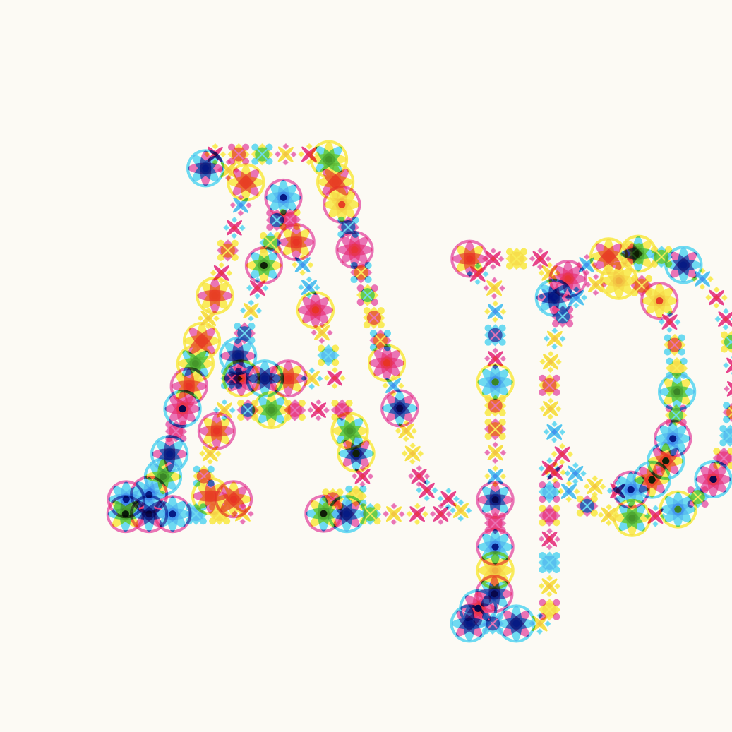
Scarlet Li
"Inspired by Karel Marten's Every Day Is a New Day calendar, Colorful Days dynamically changes over time and reflects the uniqueness of every passing day."
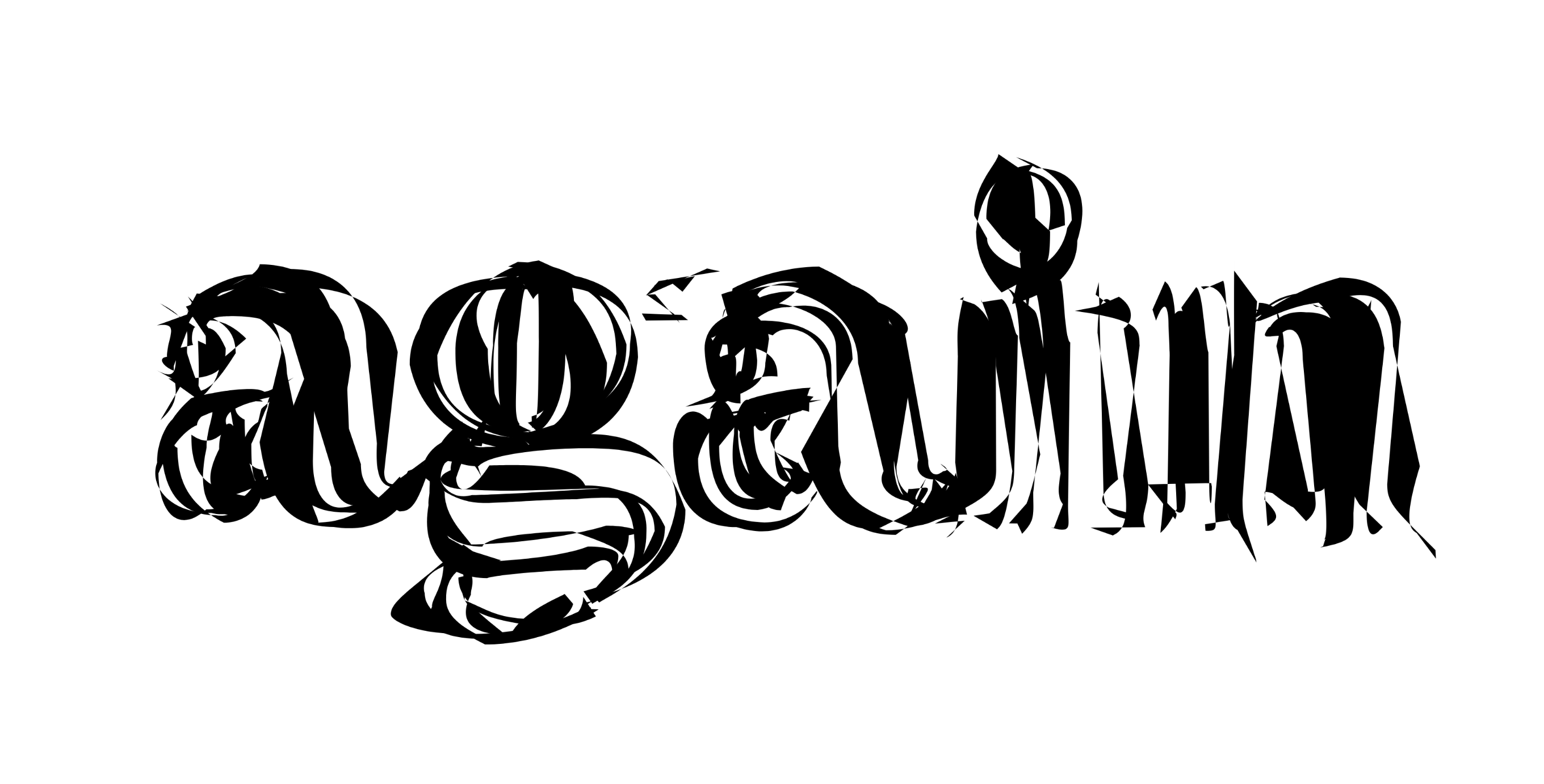
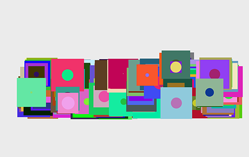
Hui Zeng
"Break these fonts: DalaPrisma, ABCGrow, Redaction, History, Koper."
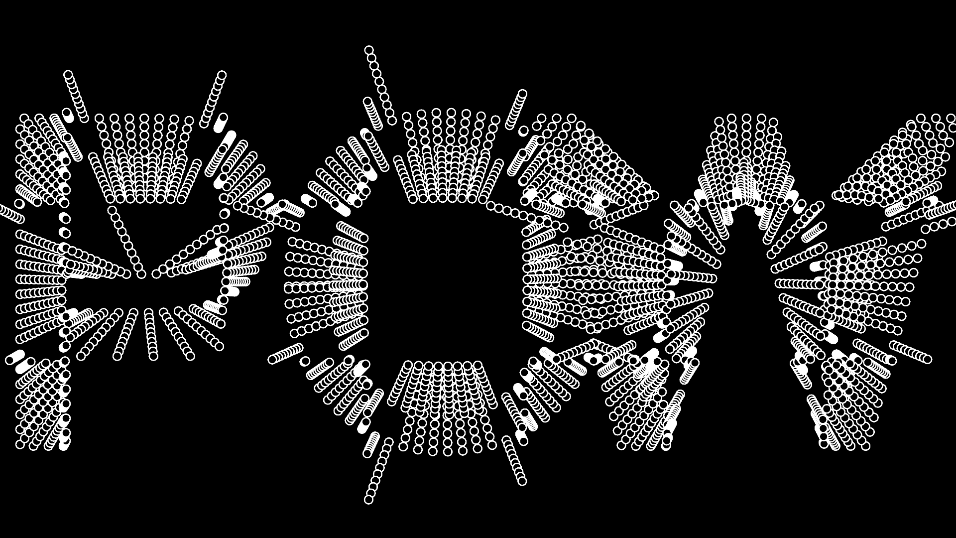
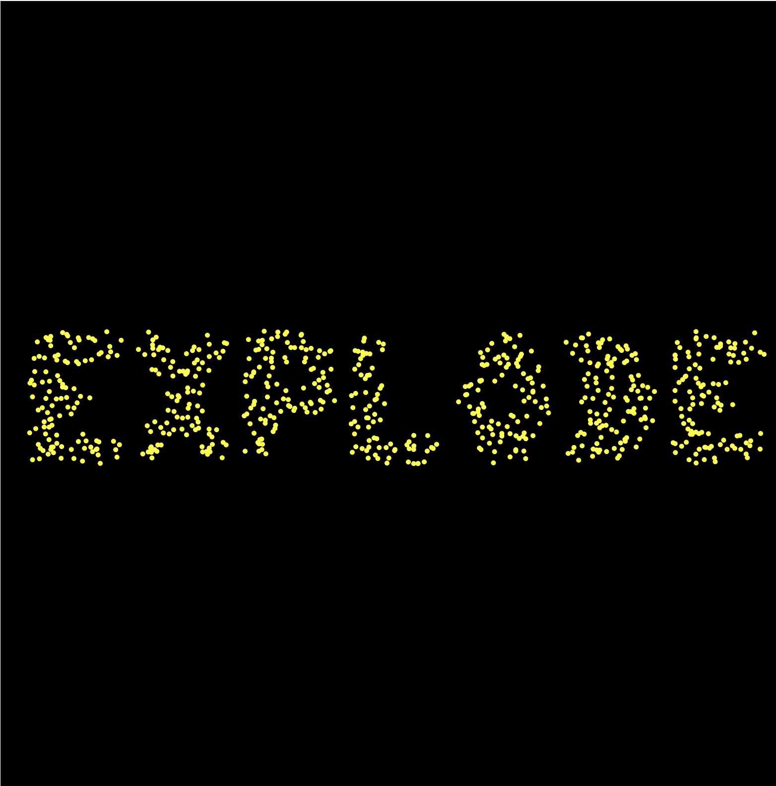
Daniela Vogel
"The font conveys the idea of fireworks. Just like fireworks that spread out from a central point and become more detailed as they expand, my font is designed to provide an experience that requires patience and perseverance from the viewer.
As you watch the graphical forms, you will discover the information hidden within, all while being entertained by the visual spectacle. In my font tool, you are the one in control. By adjusting various parameters, you can make the font display in a variety of ways, creating a unique experience."
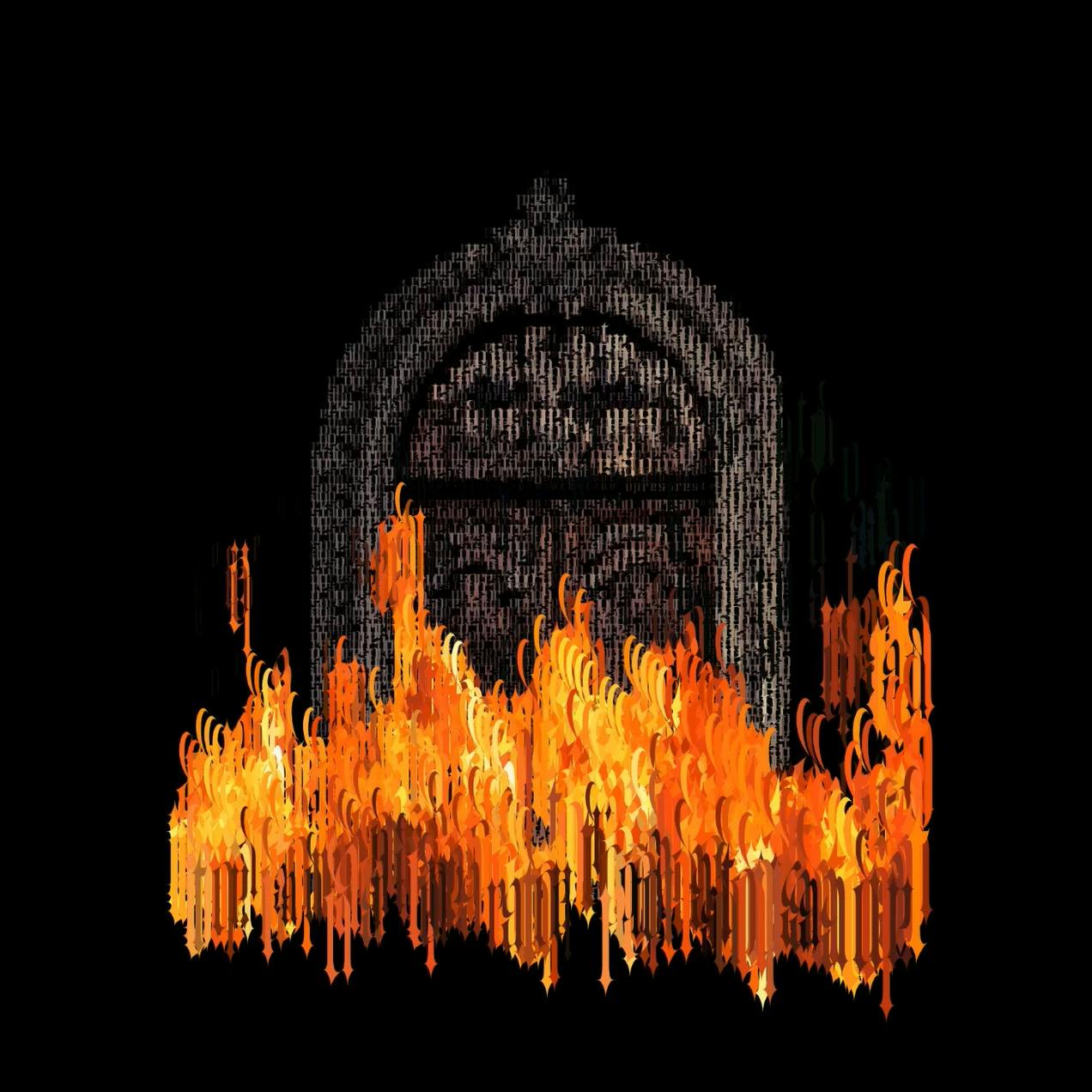
MO.MA.DESIGN
"As part of the 8M (Women day) march in my city, there was a burning of the doors of the government palace as a sign of anger towards an inept government that does nothing for the safety of women. For context, my state has the highest femicides rates in Mexico. Many of the women who participated in the burnings were arrested, and on social media it was denounced that in these arbitrary arrests they experienced violence against them.
How do they hope that we are not angry with a government that, instead of protecting us and listening to us, violates us? With this in mind I decided to make this piece as a virtual protest, representing the door (that is the exact door that was burned irl) with the words "Patriarchal State", and the fire with the words "let it burn". The fire grows with the volume of the sound, which is from a recording I made on that march."
Juju Stojanovic
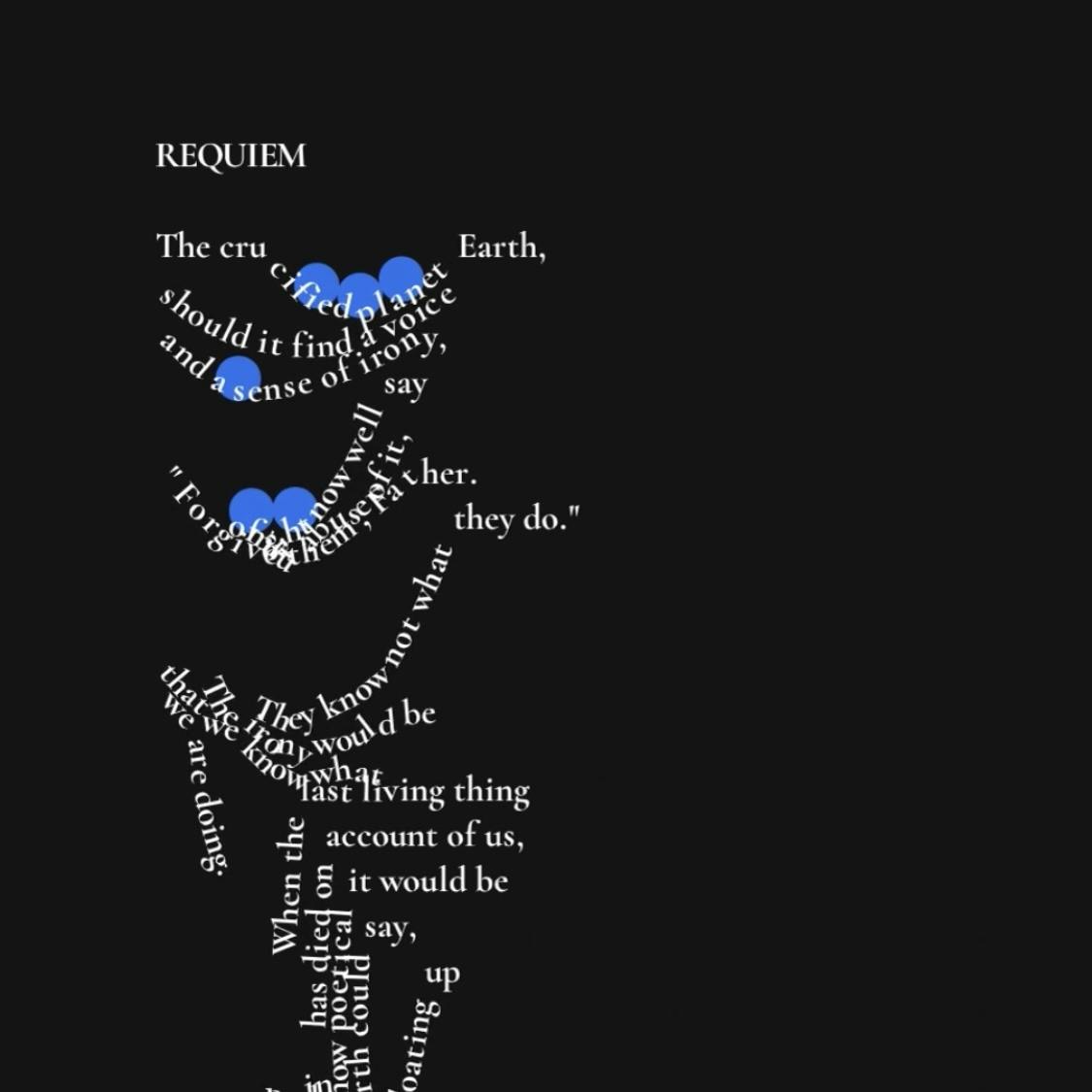
"Requiem" is a poem about our destruction of the planet Earth written by Kurt Vonnegut, an author widely known for his satirical lens on humankind. It imagines a personified planet Earth with a sense of irony that, when we have finished destroying it, remarks "'It is done.' / People did not like it here."
I wanted to create a generative interpretation of this poem that mirrors and enhances the irony of the poem. As the user destroys the poem line by line with bouncy balls, it becomes progressively tattered. At the end, the only lines that remain are the unaffected voice of the earth saying, "'It is done.'" and the sagging tired line, "People did not like it here."
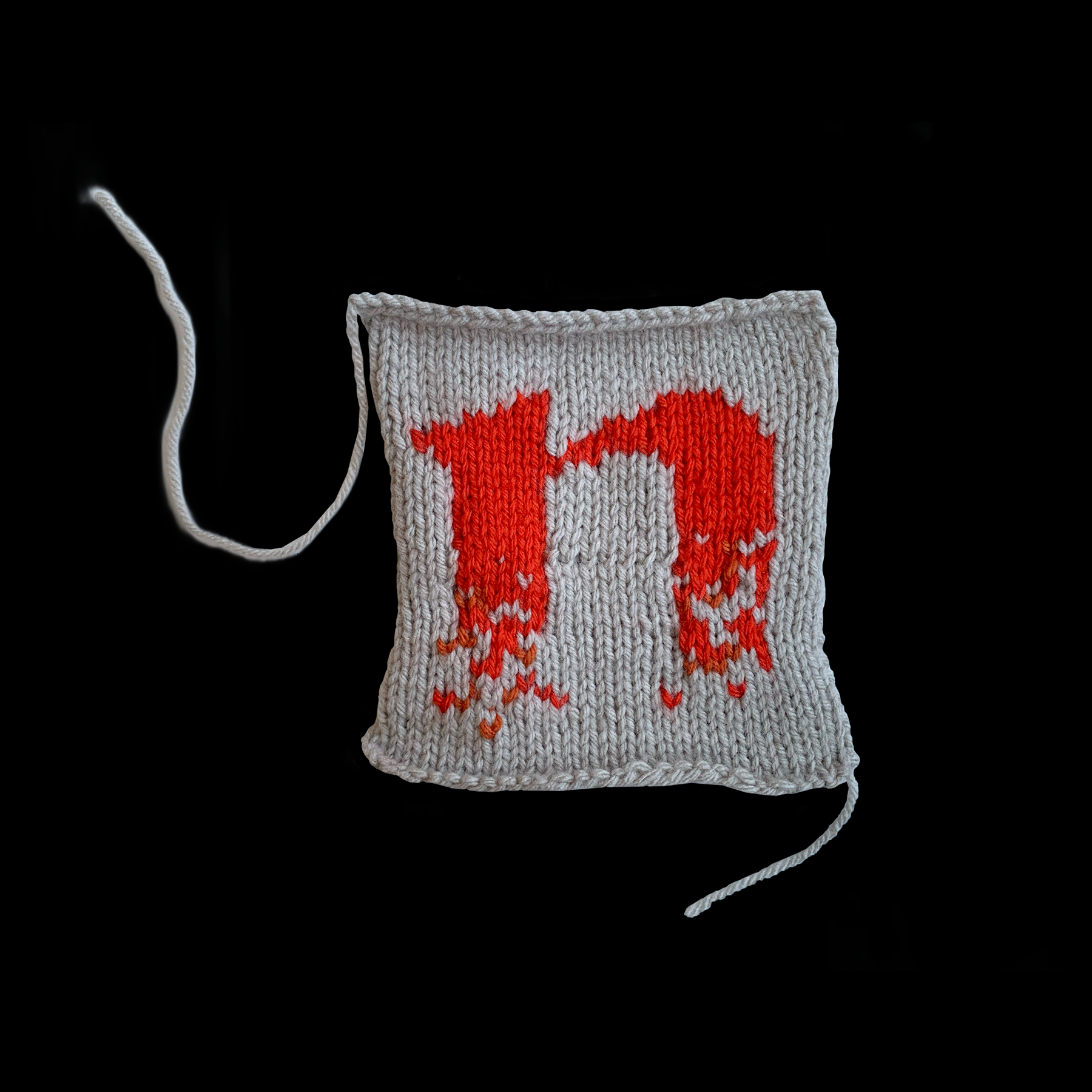
Nikki (Niktari) Makagiansar
"An experiment in translation: knitting a typographic pattern that was generated by code."
shalinster
"This mini experiment tried to play with the concept of time and motion as applied to type. I have attempted to play with several variables to create a more interesting experience around time and clock by manipulating type."
Frannie Gembis
"Is going to the car wash the same as washing your hands and cleaning the sink? Does it share the same ritualistic mundanity? Hopefully you won't experience an existential crisis in ~this~ car wash like I normally do IRL. Play with the wiggles and suds and sliders and put the car in neutral!"
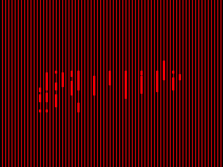
Johnelle Smith
"An exploration on visualizing sound."
Namrata Goyal
"Taking concept inspiration from Karel Marten’s Patterns and Takahiro Kurashima’s Moirémotion, I wanted to add the element of type. This sketch was an attempt at introducing interactivity and some intrigue/surprise to type specimens, making them more playful even -- with the addition of different shapes.
Though I like where it is at at the moment I want to keep improving it and adding more elements to it. Perhaps a way of adding new fonts from the viewer’s system into the sketch might be interesting to explore as a next step.
Fonts used for this sketch are from the Faune family by Alice Savoi."